Enhancing site design by getting in the minds of visitors 🔗
I have been running DCSki.com, an on-line winter sports publication and community, for over 10 years. DCSki has really become popular over the years, and I have adopted a practice of making continuous refinements based on the way people use the site. You can view a historical look at how DCSki's design has evolved over the years here. The site started as a text-only newsletter.There are two primary methods I use for determining how to optimize the site: first, I ask users directly, in an annual survey or simply by welcoming e-mail from readers. (I get dozens of e-mails from readers each week.) If a collection of users independently suggest the same new feature, that serves as low-hanging fruit, and user suggestions are almost always very easy to implement.
The second method is more complicated, but more insightful, as users often don't consciously think about how a site's design could be improved. But users leave clues behind. One popular technique is to count the number of clicks required for a user to accomplish a desired task. This can be done in a laboratory environment, where participants are asked to accomplish a specific objective and then presented with a web site to achieve that objective, but this type of experiment can be done on a "live" site as well, through data mining and analysis of log files. For example, if a user arrives at your site through a search engine -- searching on a specific keyword -- then you can assume they are trying to accomplish a specific task (learning about that keyword, especially if the keyword is fairly specific). You can then review the path they took through your web site before arriving at (or not arriving at) the page that optimally provides information on that keyword.
In DCSki's case, if someone is searching on a ski resort such as Snowshoe Mountain, a popular area in West Virginia, the "best" page on DCSki they could possibly land at is DCSki's Snowshoe Mountain Resort Profile page. This profile page has been carefully engineered to provide a large amount of useful information about Snowshoe, but it also serves to branch to other features on DCSki that provide related information. For example, the profile page also contains abstracts from recent news stories about Snowshoe, as well as the next few events, some related bargains, and even current snow conditions. So this page is the best possible "landing point" for someone doing a search on Snowshoe, but it then serves to provide exploratory paths for users to learn even more about Snowshoe, funneling them into other features on DCSki. If the user is new to DCSki, they are more likely to become a regular reader if they land on this optimal page, presented with lots of tempting paths to learn even more about Snowshoe.
None of this is by accident and, as a result, it is not surprising that DCSki's resort profile pages almost always show up in Google's top 10 or 20 search results when someone performs a Google search on the resort name. (Sometimes they show up in the top spot, even before the resort's official web site. This, as you might imagine, annoys the resorts.)
Like many web sites, DCSki provides its own on-site search engine, easily accessible from the top left corner of each page:
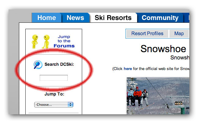
Almost every web site today has a search box, but many web design experts argue that you have failed in your site design the second a user performs a search. And, on most sites (including DCSki), users often don't find what they're looking for once they resort to the search engine. For example, in the past, if a user searched on "Snowshoe," DCSki would return dozens or hundreds of matching articles that mention Snowshoe, with a ranking that was almost certain to miss the true interest of the user. The value of on-site search engines is traditionally for very, very specific searches, which yield a small number of matches.
So, I have two goals with DCSki's search engine: first, to try and optimally direct the user to the most appropriate information, and second, to study what searches users perform in an attempt to minimize the use of the search engine in the future. In other words, by examining what searches are performed, I can try to reduce the need for users to do those searches in the future. This philosophy stems from the understanding that a user searching is most likely a failure in design.
DCSki tabulates metadata about all searches performed on-site, including the keywords. There are two scenarios I look for: the same keywords being used frequently by multiple users, and the act of "fishing" (or perhaps "floundering"), where a user performs repeated searches using slightly different keywords or synonyms -- showing a level of persistence (they really want to find something) but an inability to get the results they want through the search engine.
I have made many modifications to DCSki's design based on this analysis, for example using it to inform what should be shown on DCSki's home page -- the most valuable real estate on the whole site. But I have also realized that it is possible to deliver a satisfying search result. Most searches on a site-wide search engine end in frustration, but users remain content if they feel that they're "making progress" towards their goal and are even delighted if the search engine immediately returns what they're looking for. So, in some circumstances, the search engine can provide the most direct path for a user to arrive at an optimal page, particularly if they are visiting the site for the first time.
An early thing I noticed was that users frequently search for resort names using the search box. This, despite the fact that DCSki includes a listing of all resort profiles a few column inches below the search box, as well as a prominent "Resorts" section in DCSki's main menu. DCSki's search engine is based on full-text searching (comparing key terms against the body and metadata of articles), but I enhanced the search engine to pick up on certain terms to provide alternative results. For example, let's say that we search on Montage Mountain:
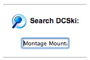
Montage Mountain used to be a ski area near Scranton, Pennsylvania, but it changed ownership several years ago and is now known as Sno Mountain. Here is the result of the search:
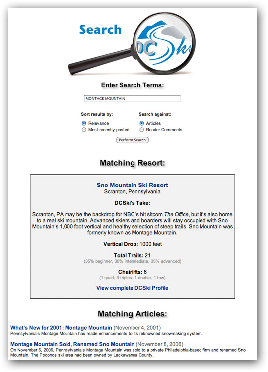
DCSki's search engine is smart enough to know that Montage Mountain is now known as Sno Mountain, and embeds a "mini resort profile" directly into the search results, complete with some real-time statistics. I do this for all resorts I cover, hitting on a wide variety of spellings for each resort name. (Is it Snowshoe or Snoshoe?)
This result is not what users are expecting; they're expecting a dry list of matching resources, fully prepared to spend time scrolling through them. But, there it is: nicely formatted, useful information about the resort -- with an irrestible invitation to go directly to the resort profile, which is where they should probably be in the first place. Of course, they might be looking for information in an article, so the search engine continues to function in that way, too.
There are many searches that have an obvious optimal landing point that traditional search engines won't deliver the user to. For example, many users have heard that DCSki provides historical information about lost ski areas in the Mid-Atlantic. Ski Magazine recently listed DCSki as a source of this information, causing a lot of new readers from across the country to go to DCSki.com. Suddenly, I saw a dramatic increase of on-site searches for "history," "lost areas," and the like. But these searches landed on news articles -- not at all what the users were looking for. So a quick optimization yielded this:
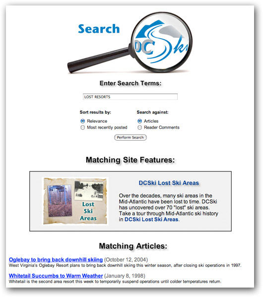
Again, the most likely match for the user is shown front and center.
Another example: DCSki has a feature called the Bargain Tracker, which tabulates and categorizes all kinds of money-saving tips for local resorts. It's a great feature if you know about it, and it's integrated throughout the site. (Resort profiles include listings of bargains for each resort, extracted from the Bargain Tracker.) But guess what a popular search is on DCSki? "Coupons." Readers new to the site might be unaware of the Bargain Tracker, but my enhanced search engine provides a perfect introduction:
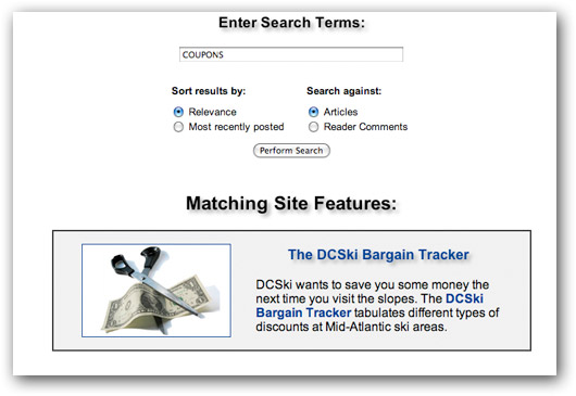
I continue to use this technique in order to reduce the distance between a user and what they're trying to find. It's been extraordinarily effective, and the effectiveness is easy to track through continued analysis.
When I first added a search engine to DCSki, years ago, it was almost a catch-all afterthought: a way for people to search for really specific stuff. But once I started to analyze how people were using the search engine, I realized a lot of people were using it to find top-level features on the site. And it wasn't doing a good job at that. So now, when I discover this, I take one of two paths (or possibly both paths): modifying the overall design of DCSki to reduce the likelihood of searches, or optimizing the search results to delight the user with a match that has a high probability of being exactly what they want. The key (and one few sites grasp) is to continually monitor the performance of your search engine and continually make adaptations -- not to simply slap it on and ignore it. Some of this can be automated, of course, but human insight is hard to beat when trying to get into the minds of readers and understand why they approached their search in the way that they did.

